It is generally agreed that advertising in its modern form has appeared in tandem with the emergence of newspapers, in the seventeenth century. Frenchman Théophraste Renaudot (1586-1653), Louis XIII's official physician, is credited with a early version of the supermarket noticeboard, a '
bureau des addresses et des rencontres'. Born in Loudon to a wealthy protestant family, Renaudot's reflections on the Parisian poor led him to create, on the Île de la Cité, what he called a ‘
bureau des addresses et des rencontres’ – an employment office for the jobless, which soon became the information center of not only for the labour market but also for those buying and selling goods, as well as a news agency for public affairs. To broadcast this information more widely, he created in 1631 the first French newspaper, which he called
La Gazette, which was publishing the very first of the modern personal ads.
In England, line advertisements in newspapers were very popular in the second half of the seventeenth century, often announcing the publication of a new book, or the opening of a new play. The first English advertising agent was probably a man named William Tayler, who opened an office in London’s Warwick Square in 1786. The firm later became known as Tayler & Newton, and it acted as an advertising sales representative for printers – several of whom had launched newspapers to promote their trade. The Great Fire of London in 1666 was a boost to this type of advertisement, as people used newspapers in the aftermath of the fire to advertise lost & found, and changes of address. These early line ads were predominantly informative, containing descriptive, rather than persuasive language.


From its early start, advertisement was about creating new tastes and new demand. Coffee is a good example, as it was first brewed into a drink in the Middle East, in the fifteenth century. The advertising of coffee's benefits in the European newspapers helped to its rapid acceptance and the development of European taste. Starting from Italy, the demand for coffee spread to throughout Europe. The first coffee advertisement in London in 1657, reads:
In Bartholomew Lane on the back side of the Old Exchange, the drink called Coffee (which is a very wholesome and Physical drink, having many excellent virtues, closes the Orifice of the Stomach, fortifies the heat within, helpeth Digestion, quickenth the Spirits, maketh the heart lightform, is good against Eye-sores, Coughs, or Colds, Rheums, Consumptions, Head-ach, Dropsy, Gout, Scurvy, Kings Evil and many others) is to be sold both in the morning and at three o'clock in the afternoon.
Thus, advertising from the start resorted to mixing pure hyperbole, curing complicated health issues like dropsy, gout and Kings Evil (scrofula - swollen abscesses in the neck), with some exaggerated truths, 'a very wholesome and Physical drink'.
After the invention of lithographic techniques advertising by posters for circus, cabaret shows, alcoholic beverages, tobacco products and some manufactured consumer goods, like bicycles, became very common by the late 19th century.
 |
| Fukunai dokusō-gan - Internal poison cleansing pills (if taken for a month, cleans various poison sicknesses such as syphilis and gonorrhea). (late 19th century) |
 |
| Shinyaku Sonota - Divine Medicine and others, with portraits of Jun Matsumoto, Shochu Sato, and Ki Hayashi. (Hashimoto Chikanobu, 1878) |
 |
| Shōni-yaku-ō Kindoru-san - King of children's drug: Kinder-Puwder (Morikawa Chikashige, 1880) |
 |
| Rakuzen-dō sanyaku: Hoyō-gan, Chinryūin, Ontsū-gan, Megusuri Seiki-sui - Three drugs from Rakuzendō for low energy, heart-burn, and constipation (Eitaku, late 19th century) |
 |
| Benri ohaguro tokiwa no tsuya - Easy to use teeth-blackening oxide, Tokiwa no tsuya means "everlasting luster" and is also the name of the woman pictured (Hasegawa Sadanobu II, late 19th century) |
Inspired by the Japanese prints, European artists; such as Toulouse-Lautrec, Eugene Grasset, Paul Berthon, Jules Cheret, Theophile Alexandre Steinlen, Pierre Bonnard, Georges Ripart, and others created artistic posters that solidified the foundations for contemporary graphic artists. The American graphic artists, such as Louis Rheade, William Schumacher, Frank Hazenplug, George Wharton Edwards, and a host of others, were also publishing their works in various periodicals and books, such as "The Century Magazine" and the "Lothrop Publishing Company." The positive impact of the colourful and eye-catching posters which represented various products and created demand encouraged corporations to invest heavily in advertisement. They spared no expense competing against each other and increase their market share through their advertising posters.


 |
| Poster from the play "Darkest Russia" from Library of Congress. In January 1894 the play "Darkest Russia" by Henry Grattan Donnelly began playing in New York. The play featured scenes in a St. Petersburg palace, Nihilists headquarters, and a Siberian exile station. The plot of the play revolved around the arrest and transportation to Siberia of innocent persons present at a revolutionary gathering. A reviewer for the New York Times described it as a "fine old melodrama of the blood-curdling sort" |
Emergence of 'mass production', and 'homogeneous consumer' A. advertising got into its stride with the industrial revolution of the late 19th century. Advances in technology made the 'mass production' of consumer goods a reality. This unprecedented availability of packaged food, ready-to-wear clothing, hygienic products, and so on, encouraged manufacturers to to seek new markets, by establishing chains of retail outlets, or distributing their products through wholesalers and intermediary retailers. The competition forced the manufacturers to seek ways to create specific demand by searing the names of their brand in the collective memories of consumers. Thus, they began to advertise heavily. In his 1984 book
A Complete Guide to Advertising, Torin Douglas states:
‘Firms such as Cadbury and Fry started packaging their products, not simply to protect them and preserve their quality, but also to establish their quality by the use of the company’s own name. Instead of leaving it to the retailer to determine which company’s products a customer would buy, they began to build their own relationship withthe customer.’
With the development of a consumer society and mass production, the role of advertisement exploded in the 20th century - particularly in the United States. The impact of the advertisement was so immense and significant that in the 1920s Albert Lasker, an ad agency executive claimed that “We are making a homogeneous” people out of a nation of immigrants .
The technological developments in printing created new possibilities for layout; defined as the art or process of arranging printed or graphic matter on a page. The organization of content is probably one of the most important and influential aspects of any good magazine, poster, and web design. A clean and efficient layout would help the message of the advertisement to be conveyed more effectively and more forcefully.

Different approaches to page layout for advertising radio (first row of images) and television sets (second row) in the early 20th century
Advertisement for a 'segmented society' However, marketing’s emphasis has been on targeting their consumers - so much so that advertisements started to show segmentation. For instance, compare the above ads for radio and television sets with the following for various food products. It is clear that the marketing strategy tries to fit a particular product to a specific group and its needs. The historian Robert Wiebe has even suggested that the divisions in advertisement —by economic, social, cultural and even psychological characteristics—now mark the United States as a “segmented society.”

Food advertising in the mid 1920s
oyle Dane Bernbach was an ad agency started in 1949 by Ned Doyle, Mac Dane, and Bill Bernbach. Starting with only 13 employees this small agency became an advertising powerhouse in the 1950s, and is now known as DDB Worldwide and continues to be a key player in the global realm of advertising. In the 1950s, the automobile industry was a stronghold of companies that mass produced large and luxurious cars. They relied on “show-off” and " keep up with the Joneses" marketing. Volkswagen, a brand that Adolf Hitler had touted during the 1930s as the “people’s car," was small and austere.
The DDB decided to represent the modest Volkswagen with advertisements that emphasized their economical practicality. Perhaps counter-intuitively. the agency boasted that their clients' cars were ugly, small and had barely changed in years. The campaign targeted devotee followers who, in the eyes of marketers, shunned ostentation and took pride in their modesty. One famous ad invited buyers to “Live Below Your Means,” presenting a car for people who could afford to spend more but chose restraint. With this in mind the layout of the Volkswagon ads was represented by minimalist and monochrome images. Pictured below the stark contrast between the Volkswagon and the typical automobile advertisements is obvious. It's interesting to note that the typical automobile ads usually contain a prosperous family in a colourful setting.

1950's DDB Volkswagon advertisements


 |
| During the early 20th century , GM's car ads transformed a simple problem of cheap transportation into a question of social status, and prestige. Advertising agencies created catchy slogans and jingles, and celebrities endorsed their favorite brands. General Motors turned market segmentation and the annual model year changeovers into national events. As the press speculated about new features, the company's added to the mystique by guarding the new designs with military secrecy. Consumers counted the days until the new models were "unveiled" at their dealers. |

Modern artistic car posters
Modern Layouts, and Alexey Brodovitch
Alexey Brodovitch is known today for his work as the art director of
Harper’s Bazaar. He was born in Ogolitchi, Russia in 1898 in an aristocratic family. He was only nineteen years old when the Bolshevik revolution flared up, forcing him to defer his goal of attending the Imperial Art Academy in order to fight in the Czarist army. When Bolsheviks won , he fled Russia with his family and future wife and, in 1920, settled in Paris. Like many other Russian emigrés of his status, he had to face both poverty and unemployment.
Fortunately Diaghilev's Ballets Russes offered him a job to paint the stage sets. Diaghilev's philosophy of the lack of boundaries between different arts influenced him, and soon he entered a poster competition which searched for the most innovatory design to announce an upcoming ball. He won the first prize, beating Picasso who was also in the competition. This was the start his career as a graphic designer.
Brodovitch also won medals for fabric, jewelry and display design at the International “Art Deco” Exhibition of Decorative Arts. Soon he was in great demand, designing restaurant décor, posters and department store advertisements. His designs was becoming noted because of their bold and refreshing sense of adventure. For instance when he was asked by Maximilien Vox, an ad agency, to design for Martini Vermouth, he did not hesitate to employ an avant-garde idea, inspired by constructivist style of El Lissitsky, using geometric forms and basic colors. He migrated to the US in 1930 to instruct design classes at Philadelphia College of Art, where he trained students in the fundamentals of European design, while working as a freelance illustrator in Philadelphia and New York. When Carmel Snow, who had been recently appointed as the editor of
Harper’s Bazaar, saw his graphic design portfolio in 1934, he immediately offered him the post of Harper's art director. Brodovitch accepted the offer and by acting as the ambassador of European modernist ideas he revolutionized magazine design.
Corporations in the US, particularly after the economic crisis of 1929, were reluctant to experiment with radically new ideas. In spite of their reluctance B
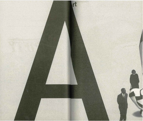
rodovitch experimented with a radically simplified, European “modern” graphic design. Understanding the value of visual communications, he gave photography the central role in the magazine layout. His approach to layouts was characterized by emphasizing on large areas of white space, in conjunction with elegant compositions of type and imagery, while creating an overall sense of rhythmic dynamism. Brodovitch believed that type and photographs are equal in their power. A single letter magnified to the size of a page is just as provocative and inspiring as a photo of a model wearing the latest fashions.
 H
He cropped his photographs, often off-center, brought them to the edge of the page, integrated them in the whole. He used his images as a frozen moment in time and often worked with succeeding pages to create a nice flow trough the entire magazine. This brought a new dynamism in fashion layouts.This was something very new and created an artistic flair to the published media. Brodovitch redefined the role of art director in a publication. Not only he supervised and designed the layout of photographs, illustrations and type on the page; but also actively searched for new talents, suggested various artistic concepts, and commissioned all forms of graphic designs. Among his proteges in New York were Irving Penn, Leslie Gill, Richard Avedon and Hiro.
In 1949 Brodovitch became director of Portfolio. He used only type on the cover, which was unusual for American magazines at that time. He wanted to create a magazine unlike any other. The first issue of the magazine was filled with a range of design influences that formed Brodovitch's creative vision. But as the high cost magazine with a small advertising revenue Portfolio ended up folding after just three issues.
Brodovitch’s personal life was an unhappy one. Because of his heavy drinking and frequent absents Harper's fired him in 1958. His wife Nina died in the same period. A series of house fires in the 1950s destroyed not only his country retreat but also his paintings, archives and library. He died in 1971 in a small village in southern France where he had spent the last three years of his life. Brodovitch’s innovative style was continued by art directors including Henry Wolf (at Esquire and Harper’s Bazaar) and Otto Storch (at McCall’s) .
Dr. Mehemed Fehmy Agha: Redefining the role of 'Art Director' in advertisement Mehemed Fehmy Agha Agha (1896- 1978) was born in Russia into a Turkish family. He studied arts at the Academy of Fine Arts in Kiev, and then entered the Emperor Peter the Great Polytechnic Institute in Czarist Russia and graduated in economics. He left Russia after the October Revolution and enrolled in the National School of Modern Oriental Languages in Paris, and received a special degree in 1923. He was a truly Renaissance man, was fluent in Russian, Turkish, German, French, Greek and English, had a strong technical and scientific aptitude, was an accomplished artist, photographer, and typographer.
In the mid- 1920s, Agha found a job as the studio chief of the Vogue headquarters at Paris, and soon was sent to Berlin as the designer of the German Vogue. Early in 1929, Conde Nast, the publisher of Vogue, whose art director Heyworth Campbell had resigned, was searching for a ; replacement. Casting out his net wide open into London, Paris and Berlin, eventually he interviewed Agha in Berlin. Nast was impressed by the "order, taste and invention" of what he had seen in Agha's work. According to Nast, he had numerous discussions with his staff and others in which he analyzed scores of back issues of Vogue, rival publications and foreign periodicals, in order to expound his theories, convictions and prejudices in the matter of makeup; "And I had invariably in such séances—and perhaps with too great an assurance—assumed the role of teacher." However, facing Agha in the interview Nast could not assume the role of a teacher anymore; "since (Agha) had at our extended interview, assumed that role himself—after relegating me politely to the dunce's corner where apparently, he thought, I really belonged." Agha migrated to the US to assume the art direction at Vogue, and it did not take long for him to distinguish himself as an extraordinary art director, and he became known as Dr. Agha.


gha radically redefined the role of the art director at every level. He fully integrated the layout process of the Vogue with the editorial process, in which design was playing a key and fundamental role. He drastically reformed the concepts of page layout, photography and illustration, with the help of many talented and influential artists such as Edward Steichen, Cecil Beaton, Hoyningen-Huene, Horst, Carl Van Vechten, and Charles Sheeler. Furthermore, he allowed artists like Willaumez, Pages and Carl Ericsonto to experiment with their wildest imagination and creativity. He reformed typographic style and introduced the sans serif type styles of Europe, and designed and conducted complicated engineering experiments to improve the color printing techniques. He brought the full force of European avant garde experimentation to the pages of
Vogue,
Vanity Fair, and
House & Garden, the Condé Nast publishing company's flagship magazines in the United States. He is described as a man of penetrating insight, unequaled wit, and at times, like the brilliant chess player he is, of dazzling intellectual wizardry.
Agha left Conde Nast in 1943 and became an active graphic and directorial consultant for numerous corporations, department stores and large publishing companies. He was deeply affected by the death of his wife in 1950. He became president of both the Art Directors Club (1935) and AIGA (1953-55). In a tribute published by PM Magazine in August 1939, William Golden wrote :
"Agha's demands seem so simple. Make something legible, present it logically and make it look somehow luxurious... in a way that he will like. So they devise not merely one version of how they think a page should look, but ten, or twenty, or forty... And for sheer productivity this method is unequalled. As for those bales of rejected layouts that have never seen the light of day; I don't think they are completely wasted. Some day, a less jaded scholar of the Graphic Arts will unearth them and discover again the amazing amount of original and exciting work that was stimulated by the man who knew too much to like anything."
A 1936 Vanity Fair double-page spread layout by Agha with photographs by Edward Steichen. This was a whole new way to use photography and layout.
Henry Wolf; a thought provoking sense of style Henry Wolf (1925- 2005) was born into a Jewish family in Vienna . He and his family fled the advancing Nazis in 1938, traveled to Paris where he began to study art. However, they had to leave for the United States in 1941. He entered at New York City's School of Industrial Arts, while also working in type and printing shops. After serving with an intelligence unit of the Army over the 1943-46 period he studied design and photography, with the legendary art director Alexey Brodovitch, when he he also working in a commercial art studio.
In 1951, Wolf became an art director for the State Department, designing publications and posters for overseas use, and a year later, accepted an offer from Esquire to became its art director. Using his artistic talent as a graphic designer he radically changed the image of the magazine and introduced a sense of elegance and sophistication that lasted even after his departure. He introduced thought-provoking photographic covers, combined with aesthetically pleasing typography; and a stable of modern artists, including Ben Shahn and Richard Lindner. After Harper's firing of Alexey Brodovitch as the art director in 1958, his job was offered to Wolf . After three years at Harper's Bazaar, and working with Richard Avedon, Man Ray and Melvin Sokolsky Wolf departed to start Show for A&P Heir Huntington Hartford.
He joined the leading global marketing communications company of McCann Erickson in 1965 , where he directed ad projects like Alka Seltzer, Buick, Gillette and Coca-Cola. Soon after he and ad executive Jane Trahey founded Trahey/Wolf, where Wolf assumed the role of the vice president and creative director directing ad campaigns for companies such as Xerox, IBM, Revlon, De Beers, Blackgama Mink, Charles of the Ritz, Elizabeth Arden, and Union Carbide. Finally, he launched Henry Wolf Productions, in 1971. He devoted himself to photography, film and design, for the next three decades. Wolf worked as both a photographer and a designer, creating numerous television commercials for companies like RCA, Revlon, Borghese, Olivetti and so on. He also taught graphic design at Parsons School of Designmarker in New York, as well as the School of Visual Arts and Cooper Unionmarker. He was an influential graphic designer and art director who believed; "A magazine should not only reflect a trend; it should help start it."

Henry Wolf Collection, Spread from Harper’s Bazaar, featuring photographs by Richard Avedon, undated
Otto Storch: Inventing Visual Distortions
Otto Storch (1913 -1999) was born in Brooklyn. He studied at New York University, the Art Students League and the New School for Social Research and graduated from Pratt Institute. He started working as a photo editor for Dell Publishing, and eventually became its art director, designing book covers, magazines and comics. He took night courses with Alexy Brodovich, who challenged Storch to quit his job at Dell and look for more challenging work. Storch began a seven year period of freelancing as a designer and photographer. Finally, in 1952. he was offered the post of assistant art director to Better Living, a magazine published by the McCall Corporation. Three years later, discovering the wide range of his artistic talents, McCall appointed him as the art director for its main publication; McCall's magazine.
In the days before computers editing, he invented a variety of photographic techniques to distort type and produce various special effects. For instance, to create the impression of words in the eye of an illiterate person, he placed type under a pair of glasses and photographed it to appear warped and bent. He also experimented with various typefaces including the 19th-century Victorian wood typefaces, which had been abandoned for decades. Under Storch, McCall’s transformed into a vibrant fashion pictorials designed for younger and perhaps more stylish women. Often the pictorials were photographed outdoors for a modern, more realistic look. In an interview that was reprinted in William Owen’s 1991 book Modern Magazine Design, he identified two “moments” in the preparation of a magazine which he considered “of supreme importance” to an art director: The first, Storch said, is the editorial conference that outlines the material to be presented and “the thinking behind it.” The second is the designer’s instructions to the photographer, illustrator and layout artists. “They want, just as I want, to have a clear visualization of what they are going to accomplish before they start.”


nfortunately, his insistence on innovation, experiment and new artistic approach gave rise to the conservative McCall’s discomfort and eventually led to Storch's resignation from McCall’s in 1967 after nearly 15 years. He returned to a successful freelance career focusing on editorial and advertising photography which included the design of an impressive booklet for the Cinerama premiere of Stanley Kubrick’s 2001: A Space Odyssey in 1968.
Quentin Fiore: The Medium is the Message (or the Massage?) Quentin Fiore was born in 1920. He is a graphic designer, who has studied at the "New Bauhaus" in Chicago. Fiore has been bold and highly creative in his art. He coauthored two books with Marshall McLuhan; the most insightful and provocative book of the 1960s; The Medium is the Massage and War and Peace in the Global Village. Fiore's typography, layout and accompanying images were superbly executed to convey McLuhan's ideas. Particularly, in the first book Fiore's images show that the characteristics of a medium in fact renders it non-neutral, and the technological means through which the information is conveyed has an effect on the human perception independent of the information content.
The word 'Massage' in the title of the book was actually a typo by the print-setter, but when McLuhan and Fiore saw the typo they liked it since it conveyed the exact message of the book. The medium is massaging the message, and produce something which is different from its content -- perhaps very much like the way statisticians are said to massage their data to produce the results they want to show. McLuhan asserts that the media are an extension of the physical and psychic faculties of man, and outlines the effect that each medium “in itself” has on the senses. From the beginning of the book, Fiore adopted an innovative pattern for the time in which an image demonstrating a media effect was presented with a textual synopsis on the facing page. The reader experiences a repeated shifting of analytic registers—from "reading" typographic print to "scanning" photographic facsimiles—reinforcing McLuhan's overarching argument that each medium produces a different "massage" or "effect" on the human sensorium. McLuhan writes;
“How much do you make? Have you ever contemplated suicide? Are you now or have you ever been…? I have here before me…Electrical information devices for universal, tyrannical womb-to-tomb surveillance are causing a very serious dilemma between our claim to privacy and the community’s need to know. The older, traditional ideas of private, isolated thoughts and actions–the patterns of mechanistic technologies–are very seriously threatened by new methods of instantaneous electric information retrieval by the electrically computerized dossier bank–that one big gossip column that is unforgiving, unforgetful and from which there is no redemption, no erasure of early ‘mistakes.’ We have already reached a point where remedial control, born out of knowledge of media and their total effects on all of us, must be exerted. How shall the new environment be programmed now that we have become so involved with each other, now that all of us have become the unwitting work force for social change? What’s that buzzzzzzzzzzzzzzzzzzzzzzzzzzzzzzzzing?”


- "The Man Who Knew Too Much," by William Golden. PM Magazine. Vol. 5, no. 2 (Aug./Sept. 1939).
- Kerry William Purcell, Alexey Brodovitch, Phaidon Press (2002).
- Gabriel Bauret, Alexey Brodo-Vitch, Assouline (2005).
- Alexey Brodovitch, Portfolio #2: A Magazine for the Graphic Arts, Zebra Press (1950).
- Roger Remington and Barbara Hodik, Nine Pioneers in American Graphic Design, The MIT Press (1992).
- Andy Grundberg , Brodovitch (Masters of American Design), Harry N Abrams (1989).
- Brodovitch: Bazaar and Beyond


No comments:
Post a Comment